- how to adapt the existing
Layoutcomponent and CSS styles to better suit the needs of our application - how to add extra NPM libraries via the yarn workspace
 command
In order to follow this tutorial, you must use Webiny version 5.18.0 or greater.
The code that we cover in this section can also be found in our GitHub examples repository . Also, if you’d like to see the complete and final code of the application we’re building, check out the full-example folder.
Ant Design Library
As our first step, let’s install the Ant Design React library and import it in our application code.
To install it, we can run the following command from our project root:
yarn workspace pinterest-clone-app add antdNotice how we had to run the yarn workspace command and specify the workspace name (pinterest-clone-app) in order to add the antd NPM package. This is because every Webiny project is organized as a monorepo and can consist of multiple workspaces. To learn more, check out the Monorepo Organization key topic.
Once the installation is complete, per the library documentation , we need to add the following import in our pinterest-clone/app/code/src/App.tsx file:
import React from "react";import { ApolloProvider } from "@apollo/react-components";import { Routes } from "@webiny/app/components/Routes";import { BrowserRouter } from "@webiny/react-router";import { createApolloClient } from "./apollo";
// An entrypoint for all SCSS styles your application might have.import "./App.scss";import "antd/dist/antd.css";
// The beginning of our React application, where we mount a couple of useful providers.// If needed, feel free to add new or modify existing providers.export const App = () => (  <>      {/* Sets up a new Apollo GraphQL client, pointed to an existing GraphQL API. */}      <ApolloProvider client={createApolloClient({ uri: process.env.REACT_APP_GRAPHQL_API_URL })}>          {/* Enables routing in our application. */}          <BrowserRouter basename={process.env.PUBLIC_URL}>              <Routes />          </BrowserRouter>      </ApolloProvider>  </>);
The pinterest-clone/app/code/src/App.tsx file contains the root App React component. This is also usually the place where we configure different libraries, use different React provider components, and more.
For more information, check out the Essential Files and Folders section of the React Application how-to guide.
Note that importing the library may visually disrupt the initial design of our application and this is to be expected. For now, we don’t need to worry about this, as, ultimately, once we complete all of the upcoming steps, everything will fall in its place.
Layout
The Layout React component, located in the pinterest-clone/app/code/src/components/Layout.tsx file, is a global component which defines the default visual layout of our application. In terms of what we’re building here, it should place the header bar at the top of the screen, and below it, render any React components that have been passed to it as its children.
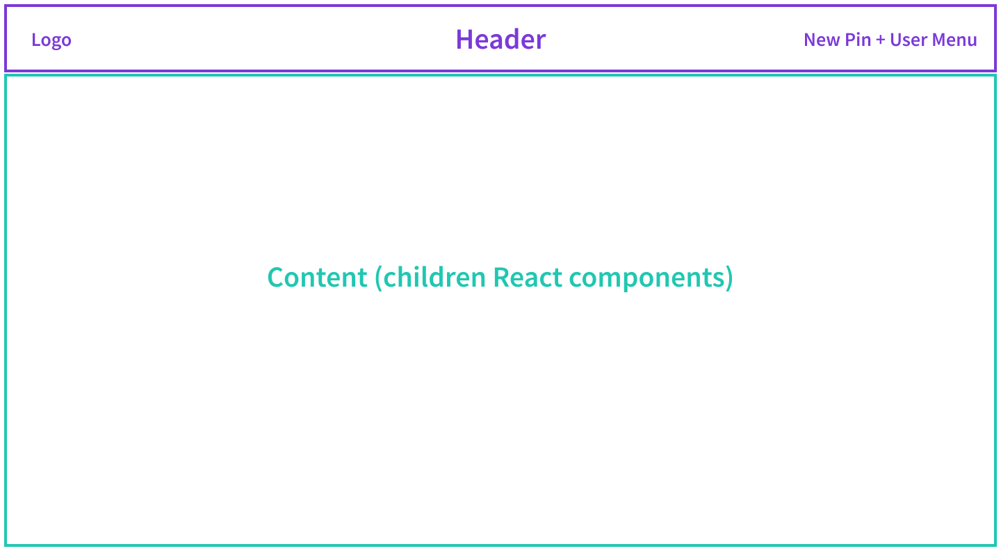
By rendering all of our application’s pages as children of the Layout component, we ensure that every page is visually consistent. And, if we decide to make a change in the layout down the road, we can do it in a single React component, and all of the pages will be affected.
Let’s prepare the layout for our application by simply replacing the code in the existing pinterest-clone/app/code/src/components/Layout.tsx file with the following:
import React from "react";
import { Divider } from "antd";
import { Link } from "@webiny/react-router";
import logo from "~/images/logo.png";

type Props = { className: string };

/**
 * The default layout component which you can use on any page.
 * Feel free to customize it or create additional layout components.
 */
const Layout: React.FC<Props> = props => {
    return (
        <div className="layout">
            {/* We're using the `nav` tag for rendering the header. */}
            <nav>
                <div>
                    <Link to={"/"}>
                        <img src={logo} className="logo" alt={"Pinterest Clone"} />
                    </Link>
                </div>
                <div>{/* This is where we'll add the New Pin and User Menu buttons. */}</div>
            </nav>
            <Divider style={{ margin: 0 }} />

            {/* The pages are rendered within the `main` tag. */}
            <main className={props.className}>{props.children}</main>
        </div>
    );
};

export default Layout;
In order for the above code to work, make sure to copy and paste the logo.png  file into the
 pinterest-clone/app/code/src/images folder.
For now, this code will only render the application logo on the left side of the header. The New Pin and User Menu on the right, shown in the above layout diagram, will be added later, in the upcoming sections of this tutorial.
If you tried to view the results of what we’ve been doing so far, you’d still be looking at an application that’s visually broken. This is because we’re missing the last piece of the puzzle, and that is adjusting the global CSS styles.
Global Styles
Time to remove some of the styles that got automatically included in the generated React application. So, let’s replace the code in pinterest-clone/app/code/src/styles/global.scss file with the following:
// Styles for the global Layout component (components/Layout.tsx).
nav {
  display: flex;
  justify-content: space-between;
  padding: 10px;
  > div {
    display: flex;
    align-content: center;
    > * {
      margin: 0 2px;
    }
    .logo {
      height: 40px;
    }
  }
}

main {
  padding: 25px 50px;
}
With this final step, we should have our application layout in place, and we should be ready to continue with the next step: building the New Pin modal dialog.
Cleaning Up the Home React Component
The final step that we need take here is cleaning up the Home component, located in the pinterest-clone/app/code/src/plugins/routes/home.tsx file, and removing the UsefulLink and UsefulLinks components, located in the pinterest-clone/app/code/src/plugins/routes/home folder.
All of these files were created during the scaffolding process, and are basically not needed by our application. Alternatively, you could also move these files into a separate backup folder of your choice, possibly for future reference.
Once cleaned up, the Home component might look something like the following:
import React from "react";
import { RoutePlugin } from "@webiny/app/plugins/RoutePlugin";
import { Route } from "@webiny/react-router";
import Layout from "~/components/Layout";

// The home page.
function Home() {
    return (
        <Layout className={"home"}>
            {/* This is where we will be rendering the list of pins. */}
        </Layout>
    );
}

// We register routes via the `RoutePlugin` plugin.
export default new RoutePlugin({
    route: <Route path="/" exact component={Home} />
});
Final Result
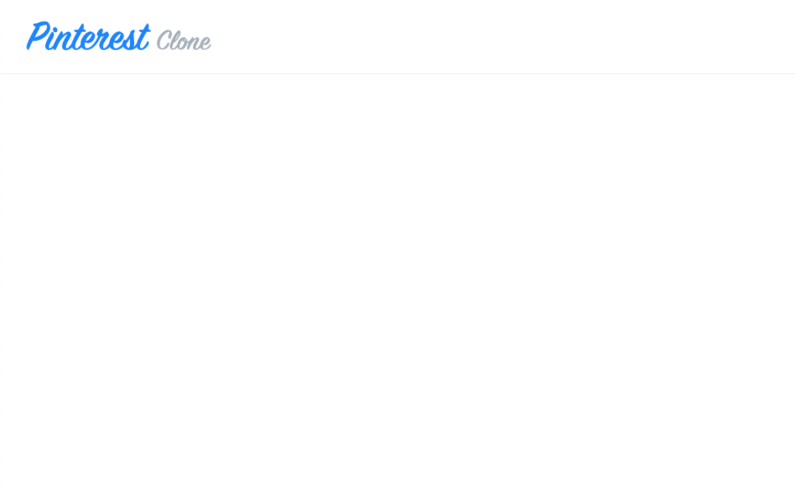
And this is what you should end up with once you’ve completed all of the steps. Basically, a blank page with just the header at the top of the screen, and that’s it.
Now that we have this foundation in place, we can start building the rest of the planned functionality.